 The Front cover of WE LOVE POP Magazine compared
to Q Magazine is the difference in colour and design. With more pictures than
words, it is evident that pictures speak louder than words to a younger target
market whereas, established magazines such as KERRANG! Contain more words and
titles than WE LOVE POP. There is also a change in the amount of colours used
and colour themes between these front covers as those that are for an older
audience of 18+ such as Q and MOJO have a few colours that suit and is a
repeated theme throughout the magazine, although overall the colour and theme
of red is common as it is used in all four magazines. They also contain fewer pictures,
as there may be one or a main singer of that specific genre whereas, there may
be a few main groups or singers for teenagers.
The Front cover of WE LOVE POP Magazine compared
to Q Magazine is the difference in colour and design. With more pictures than
words, it is evident that pictures speak louder than words to a younger target
market whereas, established magazines such as KERRANG! Contain more words and
titles than WE LOVE POP. There is also a change in the amount of colours used
and colour themes between these front covers as those that are for an older
audience of 18+ such as Q and MOJO have a few colours that suit and is a
repeated theme throughout the magazine, although overall the colour and theme
of red is common as it is used in all four magazines. They also contain fewer pictures,
as there may be one or a main singer of that specific genre whereas, there may
be a few main groups or singers for teenagers.
The font of the masthead says a lot about the magazine and
the type of magazine it is, as KERRANG! Has cracks in the word emphasising its rock
genre unlike MOJO, its font is bold and stands out, but can sometimes be hidden
by the Main Image whilst WE LOVE POP has a Masthead that stands out due to its
size.
These findings and analysis help me to choose and decide
what I would like my magazine to look like as well as a target audience and
colours together with the common conventions to follow and what goes. I have
learnt that a magazine needs a colour theme of three or four colours that will
run throughout the regulars of the magazine such as front and contents page but
also that red is a common choice and definitely attracts attention to the
magazine. I have also learnt that the masthead can connote the target audience
and genre of the magazine by its font and design as well as the size and the
colours around it.
 The Contents page in
all magazines can vary as they have different styles and conventions to apply,
as KERRANG! Has a massive advert promoting the magazine that takes up almost
half of the page, yet WE LOVE POP has used a large space to promote their main
article with lead singer Harry and do not advertise their own magazine. The
past two were single page contents pages but MOJO has a double contents page
that uses one picture to take up the majority of a page and has not many columns
for telling readers of what the magazine consists of.
The Contents page in
all magazines can vary as they have different styles and conventions to apply,
as KERRANG! Has a massive advert promoting the magazine that takes up almost
half of the page, yet WE LOVE POP has used a large space to promote their main
article with lead singer Harry and do not advertise their own magazine. The
past two were single page contents pages but MOJO has a double contents page
that uses one picture to take up the majority of a page and has not many columns
for telling readers of what the magazine consists of.
Nevertheless, there are numerous similarities between these
three different genre magazines as 2/3 state “Contents” along the top stating
the date of its release and issue number, in addition to an editors review of
the magazine. I will definitely be including the conventional “Contents” at the
top of my contents page including the issue number and release date, together
with multiple pictures of what the magazine entails, re-emphasising the masthead
of the magazine.
 Double page spreads (dps) have a few styles
that include Q&A interviews that are semi-structured or autobiographies of
a band or artist. They also have a large image that often takes up one whole
page plus other smaller ones, accompanied by a large and bold title. The
pictures can either be taken in a studio or real background. Within the page
they also contain a quote from the artist or a band member that would intrigue
the reader to read the article and find the result of what happened.
Double page spreads (dps) have a few styles
that include Q&A interviews that are semi-structured or autobiographies of
a band or artist. They also have a large image that often takes up one whole
page plus other smaller ones, accompanied by a large and bold title. The
pictures can either be taken in a studio or real background. Within the page
they also contain a quote from the artist or a band member that would intrigue
the reader to read the article and find the result of what happened.
In my dps I will have a picture that fills up the majority
of a page accompanied by a large and bold title among a quote and smaller
pictures, however, I have realised that the name of the band does not
necessarily need to be stated nor large as double page spreads are often of a famous
or well-known band or artist.

 Adverts can also tell you a lot about a
magazine because they advertise for the specific target audience, as they would
not promote men’s cologne in a teenage girls magazine because it would not
stereotypically apply to them. This includes concert dates in a music magazine,
as a pop band would not be seen in a rock music magazine. They can also contain
clothes and other accessories associated to the genre. If I was to include adverts in my magazine; which is not compulsory, these are the issues and problems i would consider.
Adverts can also tell you a lot about a
magazine because they advertise for the specific target audience, as they would
not promote men’s cologne in a teenage girls magazine because it would not
stereotypically apply to them. This includes concert dates in a music magazine,
as a pop band would not be seen in a rock music magazine. They can also contain
clothes and other accessories associated to the genre. If I was to include adverts in my magazine; which is not compulsory, these are the issues and problems i would consider.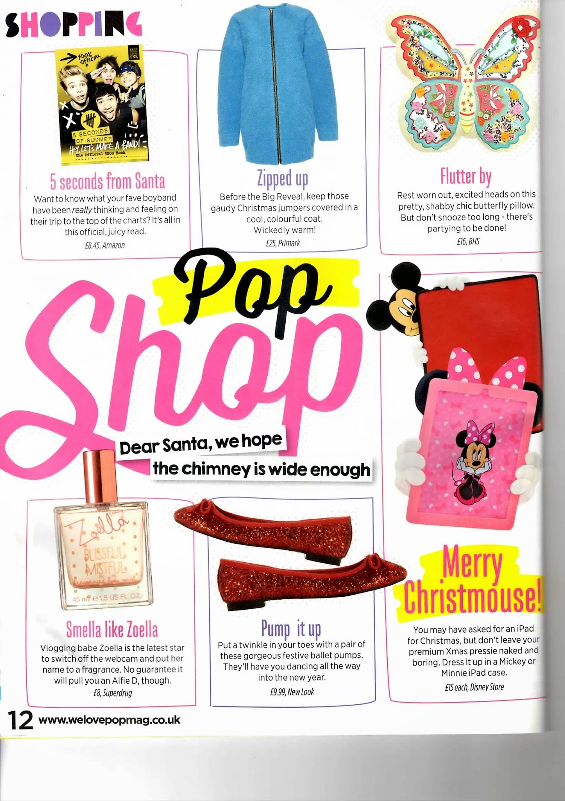


No comments:
Post a Comment