Tuesday, 24 February 2015

Flat Plan: Contents Page


This Flat Plan is a rough idea of how my Contents page will look like of where the main things will be placed well as pictures so that I will have a guide to follow when making my Contents Page. However, I have realised some mistakes in this that I will correct when it comes down to the real thing such as, the issue number, month or date and logo. These are actually some of the fundamental things I have seen in the music magazines I have bought like MOJO and WE LOVE POP.

Monday, 23 February 2015

Contents Page Sketch

This is a quick sketch idea of what my contents page will look like but is likely to change as well as it is only my first idea. But it gives me a rough idea of what it will look like and also a guide to follow in what I will finally produce, down to the slanted pictures and sub images.

Thursday, 19 February 2015

Edited Photos

               (Edited)                                                                                                    (Original)

 On the right is the original photo and on the left is the edited one. This shows the progress I have made throughout this process. However, even thought the changes made may not be so visible here, they will be when they are on a double page spread (DPS) or a contents page. Here in both these pictures (above and below) I have used tools such as the spot healing brush and patch tool, as well as the clone tool to cover up any spots but also blend any astray hairs into the background. Nevertheless, further editing has continued whilst in the process of creating my DPS where I noticed things that should change such as the humidity of the picture or saturation. 

      (Original)                                                                                                                      (Edited)
                                                                                            

Sunday, 15 February 2015

DPS Draft 3


This image shows the progress I have made on my DPS after looking at other magazines for inspirations. I have also added an imbedded quote which looks very nice as all fonts are of Sans Serif. As well as changing how I wanted to page number to be displayed.

Friday, 13 February 2015

DPS Draft 2


This is my second draft and I have changed the style to look neater and try to keep the colours within a theme. I have also changed the exposure and humidity of the photo to look darker as she was a very bright. I will continue to add sub-images and the magazine logo in the following drafts.

Tuesday, 10 February 2015

DPS Draft 1

This is my first draft of how my DPS looks. I still need to add many things to this such as the magazine name, logo, and sub-images.

Monday, 9 February 2015

Edited DPS Photo

This photo is an editing version of the original which I will be using in the DPS as I have removed spots and birth marks as well as unwanted hairs over the model's face.

Font Tests on Photoshop

These font tests on Photoshop

Friday, 6 February 2015

DPS Flat Plan

This Flat Plan is an example of what my DPS will look like, and gives me something to follow as well as a rough idea. Giving me time to decide if anything needs to changed or added. Before I start my real Double Page Spread.

Thursday, 5 February 2015

DPS Planning Sheet

What 'angle' do you have for your story?

My DPS story will be about a singer who was already famous when she was a child, but took a break from the 'showbiz' to concentrate on her education. She has decided that she wanted to come back and she is coming back as a singer. We talk to her on the first night of her performing in an arena to her fans who have come in the masses to support her and find out about what she has been doing as well as her inspirations.

What journalistic style will the article be written in?

As this is a pop magazine I will be using a Q&A style of writing that sounds fun and interesting to appeal to my main target audience. Mostly informal, there will be many quotes from the artist and the overall general sound will be light and enjoyable, still giving us an insight to the artist too.

Describe the layout design of the DPS?

The design of my DPS will have the main image on the left as well as the Main Title. On the right, there will be a quote or stand first at the top and underneath will be the main body text with two or three sub images around it. There will also be a kicker at the top right corner and page number on the bottom right corner.

What ideas do you have about the photography?

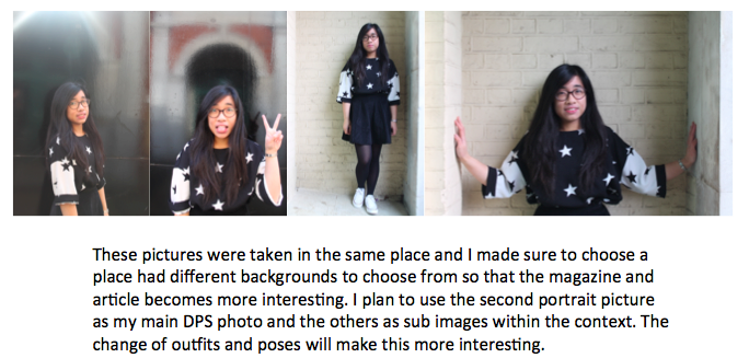
I currently do not have many ideas about the photography but it will be outside against a fairly plain or neutral background. I plan to take a range of close ups, mid and long shots, as well as fun pictures and serious pictures. As for Mise-en-Scene, my model will wear clothes in a semi formal style and I will not use a lot, if not any props at all.